Thursday, 7 April 2011

Evaluation - 3.) What kind of Media Institution might distribute your Media Product and why?

Our media product would be distributed by a company that isn’t popular such as Universal or Working Title but a company who would put this on TV, on a channel such as Film 4 or a channel that isn’t well known such as Warp Films. Some Distributor's own TV Channels, Radio Stations and Advertisements etc. Our product was made from no budget one camera and a high tech video editing Software, Adobe Premier. This shows that it could be another Paranormal Activity Film which was made by a director in his own home with a budget of £11,000 which shows that anyone can make a film from their own home but depending on how good the quality of the film is, how long it is and if there is a grasping plot then they would be a better chance that it would reach the cinema screen such as Paranormal Activity has done. Distributor's help and promote independent Film Makers as these directors want to become successful in making good quality films and become well known in the film making industry.

Warp Films is known for its typical British gritty films, such as This is England. Our Film is an example of British Gritty films, we don't have the luxurious locations or the huge studios that a bigger budget film would use. We have a typical British Mise-en-scene which attracts a British audience and would be suited for a company like Warp Films. Our film would appeal most to Warp Films, for the locations (The back path Michaella and Shasta walk down and the park) and a British audience would recognise it and appeal to it more because of the characters dress sense the fashion used is different to other countries, the locations and the British accent.

Many Companies such as Warp films, who distributed "This is England" would distribute our film because they are another companies who want to try and build a reputation and become a big distributing company such as Working Title. With these types of Distributing companies who aren't very popular, are supported through the National Lottery, who also help small film makers to make and distribute a film, but are limited to wear and how many they can show, so art houses are a source to show their film with only one film reel to show it at. Our film could have made money from the National Lottery and its UK Film Council, which also funds independent film makers and distributors.

Our Logo was based around an ironic and creepy style fitting to the Thriller Genre. Just like Working Title who are well known and successful in distributing and making Rom-Com’s they have stuck to that from the beginning as other unsuccessful films such as "The Boat that Rocked" didn’t do so well. So our logo was created with the first letter of each of our Names - M = Michaela A = Alex S = Shasta C = Chloe this gave the word "M.A.S.C" looking like the name "Mask" but in an ironic and creepy way. With the idea of masks, this can relate to Thriller conventions as Masks can give a sense of mystery and can give an identity to a villain e.g. - Scream - the villain with the Scream mask (Played by Roger Johnson)


As well has this our Logo had a connection to our Film Logo  - Stage Girls, the use of masks contain connotations to theatre, stage and performance.
Michaela said - "We decided to on the name M.A.S.C Productions because it was all our names put together, it was also a huge benefit for our theme as a mask is kind of a convention of the stage and shows."
Evaluation - 2.) How does your Media Product represent particular social groups?

Our film represents teenagers and young adults interested in Thrillers that have characters in the same age group as well as the friendship between teenagers and the dominant male over the females.


Alex "Normal/Typical Teenager fashionable" & Ariadne from Inception Normal/Typical and fashionable teenager

Alex is just a typical teenager who has style and a fashion interest. Many teenagers now are looking at Fashion and "what’s hot" and "what’s in" as does Ariadne, a typical teenager who wears fashionable clothes. Both characters wear a jacket, scarf, top with their own different pattern and style, both wear pants/jeans and shoes. We wanted to give a modern style to the film that they are typical teenagers but are put into a situation where danger occurs. Both Alex and Ariadne explore different areas, Alex in reality and Ariadne in dreams, but both have that exploration element.
Our character is in a much more serious situation than Ariadne's as she is in a dream and Alex in reality and the possibility that something could happen to her. In Ariadne's situation she can make anything impossible, possible. She can bend and move anything in her dream to her will, but Alex in a harder position where she can't find the answers instantly and can trace their steps, she has to go on foot and search for them, with an enemy lurking about and people are in danger.

Evaluation - 1.) In what ways does your Media Product use, develop or challenge forms and conventions of real Media Products?


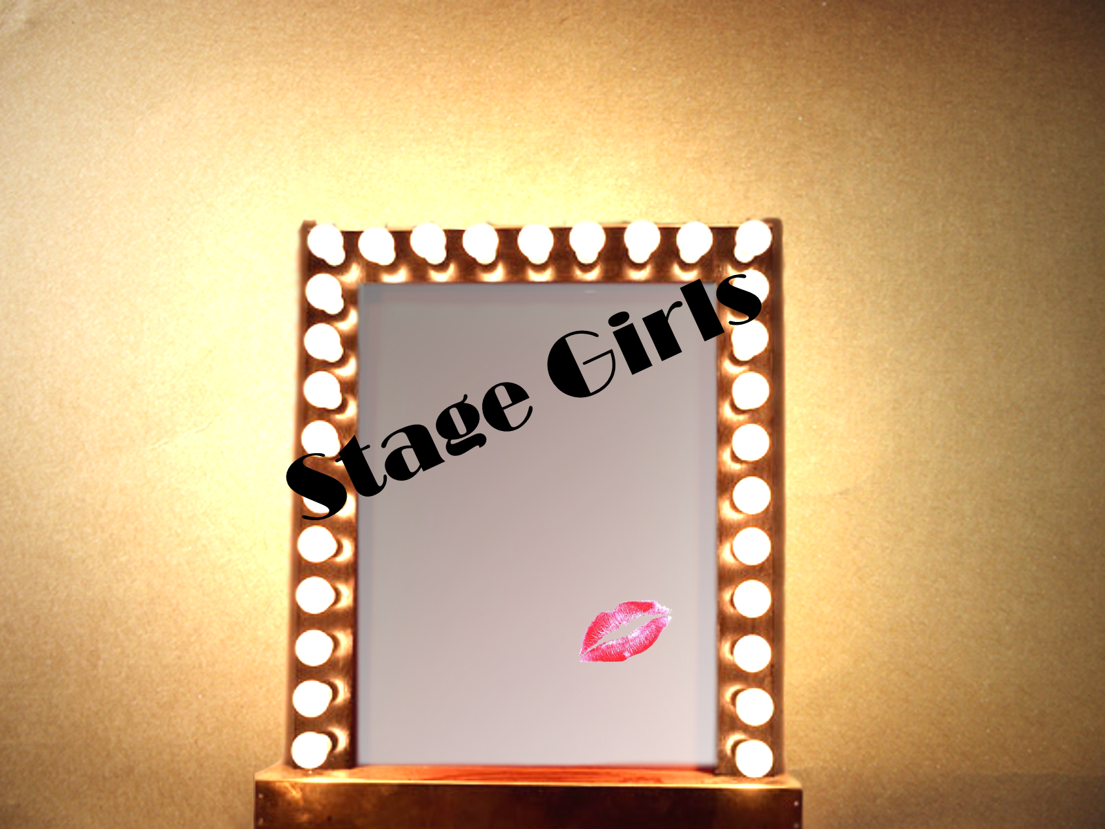
Our film contains the conventions of a Thriller by using the title of the film "Stage Girls" at the end, by showing a link to attractive females on stage being watched and/or stalked by men. Our story line has a connection to this sort of situation, by having two girls who are performers, stage girls and being stalked by a man. This gives a tense and mysterious mood, to get the audience thinking several questions at once such as "What will happen to the girls?" "Who is the stalker?" and "Will they friend find them in the end?"


With this in mind, we decided that the title "Stage Girls" will appear in the last Frame, giving a sense of mystery and eagerness for the audience to know what will happen. It was created through the following steps (See Both ""Stage Girls" Logo - Finished - The Process - Original" http://babybatchloe.blogspot.com/2011/04/stage-girls-logo-finished-process-from.html & "Final "Stage Girls" - Logo - Finished - The Process from Original to Final" http://babybatchloe.blogspot.com/2011/04/final-stage-girls-logo-finished-process.html)

To show that the typical mirror to find in a dressing room as well has keeping with the narrative of the Stage Girls link. It wouldn't be appropriate to have "Stage Girls" on a computer screen with the technical equipment that you will normally find at a computer; it doesn't fit the narrative convention or the plot.

The Font "Broadway" for the font and the text is big, overlaying the mirror to grab the audience’s attention. The simple Lips picture found here - http://browse.deviantart.com/resources/?qh=&section=&q=ohsheisgaga#/d3aj3ml
To add to the female symbol of the female characters involved in the film.
The background picture is from here - http://www.unsigneddesign.com/zenpaper/IMG_2008.JPG
Which makes it look like the mirror is actually in a room and hung upon a wall.
Although many Thriller use a darker and more unpleasant logo, however by giving a brighter and more attractive logo it catches the audiences eye and shows that Stage Girls isn't all what it seems.

Setting/Location


We used several different locations so we didn't make it look like a student made film. By using different locations we can show that the characters have been in several different locations that, if this film was to be made into a full length movie, these would be locations that characters would go back to or to be seen as key locations for other scenes earlier on. We used the Hospital scene to show that Alex's character as looked in possible locations to find her friends. By using shots of locations linked to the girls, such has the stage scene where Michaela is playing the piano, shows a key place where the girls usually visit often.

The different locations such as the Canal scene where Alex is unconscious, shows that Alex visits places too, to show her desperation to find them. By Alex waking up next to the Canal gets the audience wondering why she is there, how she got there and what has happened to her. This also shows another key scene where later in the movie characters can come back to.

These types of styles of different locations in a Thriller are key to show the audience a more mysterious feel, that this can keep the audience on their toes wondering what scenes are key and trying to put the puzzle together.

Locations also add to the key of the time of period it was set in. This sets the scene and gives also depends on what audiences like to watch certain genres in a certain time period.

Costumes and Props

Within films costumes and props are the most important element along side continuity; this shows a key to the time of period it was set in. The costumes used in ours are modern, showing the film was filmed in the current period/century. The costumes also add to the type of characters they is, all the girls are fashionable and stylish, that the stage girls are pretty and dress attractive to show that Female symbolism that Males will be attracted to.
The costume that Aaron wears, are dark, to show mystery and to give the audience something to identify this also gives him that Stalker status from sniffing the scarf and stalking them.

The use of props was a main key; as we had to use the scarf has a main item that the stalker picks up and sniffs to show his characteristics that he is a stalker. This links in with the scream of Michaela (Lucy) and Shasta (Jenny), where Shasta's dialogue at the beginning of the frame is "I've forgotten my scarf" and later on we see them walking in the park and sitting on a bench. The link is when Aaron picks up the scarf from the exact bench that the girls have left to show that the stalker has found the scarf and Shasta (Jenny) might not find it again and this also gets the audience thinking about what the stalker will do with the scarf.

Camerawork and Editing

The frames are mainly edited through Overlay, Cross fading and dip to black. The Overlay show the memories and other key elements of the characters, for example, Alex running over the bridge and the overlay of Michaela playing the piano, shows who Alex is looking for, that she is remembering them thinking about the memories what she knew them for and that this also shows that her friends are always on her mind that they are who she is looking for.

I choose to use the different types of camera shots and combine them with the editing effects to stick with the narrative conventions and to allow the audience to understand the story.

Title Font and Style


For both logos, fonts and styles are different. The Company Logo uses "Adobe Caslon Pro" and the Font Style is "Semibold" with a 4 colour gradient. This font setting is also used for the Producer, Director and Actors names, to keep with the style of the film. Our Film Logo is different from the company logo; we didn't use the same font. From my research I have found that some films don't use the same font from their film logo to their film or they don't use their company font for their film. I thought it was best to keep with the company's unique touch and to give the logo a different style, showing that if we ever did make any more films this would be a sort of trademark or pattern that we use in our films to make the film have a owner in a way, letting the audience know who produced it.

Story and how the opening sets it up

We see the first shot of Alex laying on the floor and waking up, then with an overlay of the girls screaming, showing that Alex is waking up from the screams and remembers she was looking for the girls. She starts to remember them from their performances, playing the piano. As she is running over the bridge she is remembering them from these memories, which shows the audience who she is looking for and makes them wonder where they have gone. Later on we see Aaron picking up the scarf at the location they have been, which indicates that he might have something to do with them going missing.

Genre and how the opening suggests it

Our genre of Thriller is used within the opening by using the narrative conventions of girls going missing, the mysterious awaking of Alex and remembering them, the stalker doing the creepy and disturbing things such as sniffing the scarf and stalking them behind the curtain. With this we have the Mystery and the puzzle that the audience as the figure out and identifying the good and the bad guys. The scarf is a key item and shows how the stalker tracks down his targets as well has Alex being a key character along side the stalker, her waking up suggests many possibilities of why she is unconscious and will she find them in time as well has what the stalker will do and what did the girls see when they screamed.

How Characters are Introduced

Each character is introduced in a chronological way. Alex is introduced first to show the main character, the audience will be following Alex on her journey to finding her friends; she is then running and shouting the names of her friends to show that she is looking for them. Michaela (Lucy) and Shasta (Jenny) are seen walking and then turning around after Shasta says "I have forgotten my Scarf" and then turning around and screaming. We then see them again as an overlay where Alex wakes up and they are walking through the park and sitting on a bench. We are introduced to Aaron as he is walking from behind a tree and is walking to the bench, picks up the scarf and sniffs it. We don't see Aaron's face in detail he is dressed all in black and as he sniffs the scarf this shows that he is a mysterious character and is portrayed as a disturbing person. We then see him again behind the curtain looking at the girls which shows that he is the stalker and he is identified as the bad guy.

Special FX

We didn't use Special FX as such; we didn't use Green screen or CGI not like the sort of Special FX you get in Terminator or Star Wars. We only used effects such as Overlay and adjusting the Opacity to make the audience see more than one clip clearly and to show which clip is more important or dominant than the other.

The Film - Uploaded

Our Film is now up on my Channel on Youtube and on my Twitter Account on Twitvid. By using more than one source we can gain extra feedback from a variety of audiences.


Youtube - http://www.youtube.com/watch?v=Ms4oVjTMsmE
My Channel - chloeb1993 - http://www.youtube.com/user/chloeb1993

Here is the Final Product, our film. Enjoy!


We placed the video up on Youtube to get feedback and to see what people liked and didnt like and to see what we could of done differently as well as to see if out story is easly understood.

I got feedback from one of my Subscribers on Youtube - BriseisKenobi


Friday, 1 April 2011

Editing - Last Touches and Brightness and Contrast Issues

1.) Opacity - This makes the footage darker/less colourful by reducing the numbers.
2.) Brightness and Contrast - Makes the footage  brighter/darker less/more colourful to add effect and atmosphere to the scene.


 By adding Brightness and Contrast and changing Opacity you click on the footage that you would like to edit and go onto Opacity which originally will be on 100.0% and then using your mouse click on the number and the mouse arrow will change to a horizontal arrow and then slide the mouse left or right to adjust the darkness of the clip. Same with Brightness and Contrast Slide the numbers to change the Brightness and how colourful you want it.


I have looked at our footage and they have been some problems with the Brightness and Contrast edits. We have made some of the footage darker and some of them brighter, to make the some scenes look less busy and not too complicated so that the audience won't get the plot or loose interest. So I took the footage from the Video 1 panel on the time line for the performance pieces of Michaela and saw that I had placed in the Effects Controls the Brightness and Contrast settings twice so I removed both and edited the Opacity instead. I have edited the Opacity on other pieces of Footage so that it didn't look like it was becoming darker and then lighter when it shouldn't do, looking like it was fading in and out.

With these issues solved we have decided to put a Voice over onto the film of a recording of someone on the radio saying that two girls have gone missing. This will get the audience to understand what the story is about and to keep with the narrative conventions. We received feedback from friends and they hardly knew what the story was about, they told us their interpretations which where different to what the actual story is about. So by adding in the voice over the audience know what the story line is and this can hold their attention and makes them think of what might happen to the girls.

Thursday - 31st March

I was not present on this as, has I was away on a University Convention Trip, But Alex made some changes to the video to make sure that the audience understood what is going on.

Here she has put the screaming of Michaela and Shasta at the beginning where she wakes up, as though waking up from the screams.

I feel that this is much better to understand as Alex can be woken up from the screams and remembers she has to start looking for them knowing that they have gone missing.

Here she has put added another layer of the Close up of Alex again to give a better effect of the awakening from the unconsciousness.


Here she has put the Logo at the end. I feel this has makes me want to know what happens and now knowing the title of the film it can give a better understanding of the story and how the title can be related to the characters "Stage Girls" knowing that the girls are performers and that they are being stalked (Aaron stalking them from behind the curtain and sniffing the scarf)

Here she has made the scene where she is running over the bridge and the piano overlay darker to give a more mysterious and dark atmosphere a sort of gloom and sadness that she as lost her friends.


I feel that the footage is much better and has progressed well. The film has more of an understanding and now is tied up and finished.

Unfortunately we are not adding the recording of Alex's brother has a Radio announcement of the girls going missing as Alex got feedback from our teacher that it was best not to have it as they would be too much going on and that with Alex's editing of the clip it is now much more clear of the story. 

Final "Stage Girls" Logo - Finished - The Process from Original to Final

After some feedback off my teacher and the rest of the group, we decided that the mirror needs cropping, a different background and the "Stage Girls" needs to be bigger and put across the mirror. So with some help with a friend who has experienced with Photoshop CS at home, I uploaded it into Photoshop CS and cropped the mirror, changed the background and the lights were also changed too, as I only used the Mirror picture taken from Google Images so it would be easier to edit.


 I uploaded the picture and cropped it using the lasso tool. The magnetic Lasso tool is easier to use as it finds the areas you want to crop, attaching itself to the areas you are going round with your mouse and therefore makes the cropping process easier and makes the picture look smooth.


Here is the cropped mirror and there is still some edges that needs to be smoothed out. So by using the blur tool the edges become softer which allows me to edit the edges better through the Eraser process.


 Here I have used the Clone tool to make the bottom of the mirror on the slanted side, where the lasso didn't pick up the bottom of the mirror and the wallpaper is still there, I can use one part of the mirror to look like the opposite so that no one knows it was suppose to be like that.


Here I have copied the cropped picture mirror into the new Background taken from here (http://www.unsigneddesign.com/zenpaper/IMG_2008.JPG) and some areas need Erasing as they look unreal and not straight. By doing so you click on Layer 1 in the Right hand panel and click on the Eraser tool and by holding down and moving the mouse you can erase the areas you don't need.


 In this section I have edited the lights by going to Filter - Render - Lighting Effects. I found this was different to that in Photo Impact 10 but the Cloning and the Eraser tools are similar.
 Here is the Lighting Editing Box, it is layed out differently to that in Photo Impact 10. In this you can position the circle anywhere in the picture and make it smaller or bigger to suite how far you want the lighting to go out. You can also changed the shape of the Circle, the light type and its intensity, how glossy you want it, its material from Plastic to Metallic, the Exposure to be Over or under as well has the Ambiance being positive or negative.

I then uploaded the picture into Microsoft Picture it! 9 at home and added the font and Lips. Chloe, who helped me with the mirror, made the Red glass that should be the mirror look better. I couldn't find a suitable reflective mirror glass that would fit into it.


"Stage Girls" Logo - Finished - The Process - Original

I have finished the Original Logo for our film, this had some feedback and there is a step by step in the Blog (Final "Stage Girls" Logo - Finished - The Process from Original to Final) Here is the step by step process of the Original Logo. Here is the Original logo and screen grabs of the process.


The Mirror was taken from Google Maps - http://www.google.co.uk/imgres?imgurl=http://www.halle.co.uk/siteFiles/images/p_theatre_mirror.jpg&imgrefurl=http://www.halle.co.uk/p_sat17apr10.asp&usg=__Mya1odTYo7BUEDJsbfQq_FS4NDc=&h=420&w=361&sz=33&hl=en&start=18&zoom=1&itbs=1&tbnid=6cDjXUXO-zC1YM:&tbnh=125&tbnw=107&prev=/images%3Fq%3Dmirror%2Bwith%2Blights%26hl%3Den%26safe%3Dactive%26sa%3DN%26gbv%3D2%26ndsp%3D20%26tbm%3Disch&ei=eo-VTcWjOI7Hswa2tKWZBQ

The Lips were taken from Deviant Art (Resources and Stock/PNG File) (http://browse.deviantart.com/resources/?qh=&section=&q=ohsheisgaga#/d3aj3ml)
The Text is written in Broadway.
Here is how I made it from the original to the one above.


I upload the image into Photo Impact 10 (A software already installed onto my computer, I have used this software for my own personal use e.g. Fan Art for Deviant Art and I have self taught myself to use the effects and how they work and what they do.) I wanted to make the picture brighter and make it look as thought the lights are brighter and are actually ting up the wall and the mirror. Go to Effect - Lighting - Lights


 The Lights editing box appears. This allows you to position the direction of the light, how strong it is (Light), the Exposure, Ambiance, Skew (put the light on a slant, not parallel or twist), Spread of the light (high and wide the light is), Distance of the light, Elevation and add another layer of light.
 Has you can see I have not adjusted it yet, the Red Square is connected with a Green Ling
to two other Blue Squares. The Red Square represents the position, how high or how low the light is and the Green line attached to the Blue Squares represents the direction of the light and how wide it is.

As you can see here I have moved the Red Square to the top, where it can spread the light better and I have moved the Blue squares down across to the bottom corners so the light reaches further and covers the picture better.


Here is the final lighting effects done. I am pleased with the outcome and all I need to do now is look at the finishing touches, the Font the Lips Picture.


I add the text by clicking on the Text button, scroll down on the list of texts to get to Broadway and choose my font size and keep the colour Black. After typing in Stage Girls I rotated the text on a slant. I found I couldn't slant it so I opened I saved the file and opened it up in Microsoft Picture it! 9 (the programme is already opened at the bottom in the screenshot, this is where I also placed the PNG Picture, I find some aspects of editing in this software easier and simple than those in Photo Impact 10)