Friday, 1 April 2011

Editing - Last Touches and Brightness and Contrast Issues

1.) Opacity - This makes the footage darker/less colourful by reducing the numbers.
2.) Brightness and Contrast - Makes the footage  brighter/darker less/more colourful to add effect and atmosphere to the scene.


 By adding Brightness and Contrast and changing Opacity you click on the footage that you would like to edit and go onto Opacity which originally will be on 100.0% and then using your mouse click on the number and the mouse arrow will change to a horizontal arrow and then slide the mouse left or right to adjust the darkness of the clip. Same with Brightness and Contrast Slide the numbers to change the Brightness and how colourful you want it.


I have looked at our footage and they have been some problems with the Brightness and Contrast edits. We have made some of the footage darker and some of them brighter, to make the some scenes look less busy and not too complicated so that the audience won't get the plot or loose interest. So I took the footage from the Video 1 panel on the time line for the performance pieces of Michaela and saw that I had placed in the Effects Controls the Brightness and Contrast settings twice so I removed both and edited the Opacity instead. I have edited the Opacity on other pieces of Footage so that it didn't look like it was becoming darker and then lighter when it shouldn't do, looking like it was fading in and out.

With these issues solved we have decided to put a Voice over onto the film of a recording of someone on the radio saying that two girls have gone missing. This will get the audience to understand what the story is about and to keep with the narrative conventions. We received feedback from friends and they hardly knew what the story was about, they told us their interpretations which where different to what the actual story is about. So by adding in the voice over the audience know what the story line is and this can hold their attention and makes them think of what might happen to the girls.

Thursday - 31st March

I was not present on this as, has I was away on a University Convention Trip, But Alex made some changes to the video to make sure that the audience understood what is going on.

Here she has put the screaming of Michaela and Shasta at the beginning where she wakes up, as though waking up from the screams.

I feel that this is much better to understand as Alex can be woken up from the screams and remembers she has to start looking for them knowing that they have gone missing.

Here she has put added another layer of the Close up of Alex again to give a better effect of the awakening from the unconsciousness.


Here she has put the Logo at the end. I feel this has makes me want to know what happens and now knowing the title of the film it can give a better understanding of the story and how the title can be related to the characters "Stage Girls" knowing that the girls are performers and that they are being stalked (Aaron stalking them from behind the curtain and sniffing the scarf)

Here she has made the scene where she is running over the bridge and the piano overlay darker to give a more mysterious and dark atmosphere a sort of gloom and sadness that she as lost her friends.


I feel that the footage is much better and has progressed well. The film has more of an understanding and now is tied up and finished.

Unfortunately we are not adding the recording of Alex's brother has a Radio announcement of the girls going missing as Alex got feedback from our teacher that it was best not to have it as they would be too much going on and that with Alex's editing of the clip it is now much more clear of the story. 

Final "Stage Girls" Logo - Finished - The Process from Original to Final

After some feedback off my teacher and the rest of the group, we decided that the mirror needs cropping, a different background and the "Stage Girls" needs to be bigger and put across the mirror. So with some help with a friend who has experienced with Photoshop CS at home, I uploaded it into Photoshop CS and cropped the mirror, changed the background and the lights were also changed too, as I only used the Mirror picture taken from Google Images so it would be easier to edit.


 I uploaded the picture and cropped it using the lasso tool. The magnetic Lasso tool is easier to use as it finds the areas you want to crop, attaching itself to the areas you are going round with your mouse and therefore makes the cropping process easier and makes the picture look smooth.


Here is the cropped mirror and there is still some edges that needs to be smoothed out. So by using the blur tool the edges become softer which allows me to edit the edges better through the Eraser process.


 Here I have used the Clone tool to make the bottom of the mirror on the slanted side, where the lasso didn't pick up the bottom of the mirror and the wallpaper is still there, I can use one part of the mirror to look like the opposite so that no one knows it was suppose to be like that.


Here I have copied the cropped picture mirror into the new Background taken from here (http://www.unsigneddesign.com/zenpaper/IMG_2008.JPG) and some areas need Erasing as they look unreal and not straight. By doing so you click on Layer 1 in the Right hand panel and click on the Eraser tool and by holding down and moving the mouse you can erase the areas you don't need.


 In this section I have edited the lights by going to Filter - Render - Lighting Effects. I found this was different to that in Photo Impact 10 but the Cloning and the Eraser tools are similar.
 Here is the Lighting Editing Box, it is layed out differently to that in Photo Impact 10. In this you can position the circle anywhere in the picture and make it smaller or bigger to suite how far you want the lighting to go out. You can also changed the shape of the Circle, the light type and its intensity, how glossy you want it, its material from Plastic to Metallic, the Exposure to be Over or under as well has the Ambiance being positive or negative.

I then uploaded the picture into Microsoft Picture it! 9 at home and added the font and Lips. Chloe, who helped me with the mirror, made the Red glass that should be the mirror look better. I couldn't find a suitable reflective mirror glass that would fit into it.


"Stage Girls" Logo - Finished - The Process - Original

I have finished the Original Logo for our film, this had some feedback and there is a step by step in the Blog (Final "Stage Girls" Logo - Finished - The Process from Original to Final) Here is the step by step process of the Original Logo. Here is the Original logo and screen grabs of the process.


The Mirror was taken from Google Maps - http://www.google.co.uk/imgres?imgurl=http://www.halle.co.uk/siteFiles/images/p_theatre_mirror.jpg&imgrefurl=http://www.halle.co.uk/p_sat17apr10.asp&usg=__Mya1odTYo7BUEDJsbfQq_FS4NDc=&h=420&w=361&sz=33&hl=en&start=18&zoom=1&itbs=1&tbnid=6cDjXUXO-zC1YM:&tbnh=125&tbnw=107&prev=/images%3Fq%3Dmirror%2Bwith%2Blights%26hl%3Den%26safe%3Dactive%26sa%3DN%26gbv%3D2%26ndsp%3D20%26tbm%3Disch&ei=eo-VTcWjOI7Hswa2tKWZBQ

The Lips were taken from Deviant Art (Resources and Stock/PNG File) (http://browse.deviantart.com/resources/?qh=&section=&q=ohsheisgaga#/d3aj3ml)
The Text is written in Broadway.
Here is how I made it from the original to the one above.


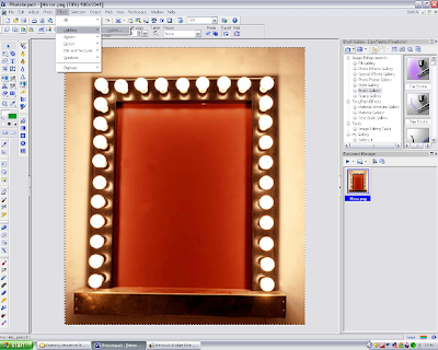
I upload the image into Photo Impact 10 (A software already installed onto my computer, I have used this software for my own personal use e.g. Fan Art for Deviant Art and I have self taught myself to use the effects and how they work and what they do.) I wanted to make the picture brighter and make it look as thought the lights are brighter and are actually ting up the wall and the mirror. Go to Effect - Lighting - Lights


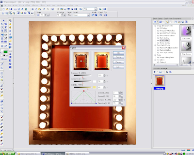
 The Lights editing box appears. This allows you to position the direction of the light, how strong it is (Light), the Exposure, Ambiance, Skew (put the light on a slant, not parallel or twist), Spread of the light (high and wide the light is), Distance of the light, Elevation and add another layer of light.
 Has you can see I have not adjusted it yet, the Red Square is connected with a Green Ling
to two other Blue Squares. The Red Square represents the position, how high or how low the light is and the Green line attached to the Blue Squares represents the direction of the light and how wide it is.

As you can see here I have moved the Red Square to the top, where it can spread the light better and I have moved the Blue squares down across to the bottom corners so the light reaches further and covers the picture better.


Here is the final lighting effects done. I am pleased with the outcome and all I need to do now is look at the finishing touches, the Font the Lips Picture.


I add the text by clicking on the Text button, scroll down on the list of texts to get to Broadway and choose my font size and keep the colour Black. After typing in Stage Girls I rotated the text on a slant. I found I couldn't slant it so I opened I saved the file and opened it up in Microsoft Picture it! 9 (the programme is already opened at the bottom in the screenshot, this is where I also placed the PNG Picture, I find some aspects of editing in this software easier and simple than those in Photo Impact 10)